In her book, Technical Writing, Reep explains important factors that lead to good document design. Her advice can be applied to most documents, and I think what she says will be quite useful for my followers.
Reep states that, in order to create a well-designed document, one should keep balance and typefaces in mind, as well as use graphic aids, headings, white space, and colour.
Reep states that, in order to create a well-designed document, one should keep balance and typefaces in mind, as well as use graphic aids, headings, white space, and colour.
Balance – This refers to the visual weight of images, text or shapes on the page. An example of a badly balanced document would be if on the left side of a pamphlet there is solid text, but on the right side of the pamphlet page is white space. Similarly, the document should be consistent in balance from page to page, i.e do not have a two-page document full of text on the first page, only to have one paragraph in the middle of the next page. If a document is unbalanced it may unsettle the reader and cause the intended message to not be interpreted, thus this is an important principle to follow.
 |
| Does this image unsettle you? It could use a bit more balance and a better colour scheme. |
Typeface – This refers to the fonts and styles of text in a document. A typeface states to readers how formal or informal a text is, with certain typefaces being inappropriate for some texts. For example, the font Chiller should not be used in an email to a manager or an academic essay as it is informal. Furthermore, be consistent, do not change typeface in a text, unless establishing a point, as it can be distracting to the reader.
Graphic Aids – This refers to tables, graphs and diagrams that may help the reader understand content in a visual manner. Important in technical documents, graphic aids can easily sum up complex and large amounts of information, particularly if it is numerical in nature. Furthermore, some things are just simpler to convey visually, such as how to assemble a piece of furniture.
There are some things one should keep in mind on this topic:
- All graphic aids should be labelled, to not cause confusion as to its purpose.
- Refer to the graphic aids in the text; do not put in graphics that you do not need as this can cause more confusion than if it were not there.
- Make sure that text that is referencing the image is positioned as near to the graphic as possible; you may choose to use an appendix if it becomes messy.
 |
| A simple graph looks much better than a lot of data |
Headings – These are used to: structure a document, help the reader find specific text, highlight changes and occurrences of topics, and provide visual relief by breaking up text. A heading is used at the start of the topic, and changes as the topic does. Try not to have one heading every few pages, instead split the document up into multiple subheadings. Also, having headings too often can negatively impact the design of your document, thus try to group up your text so as to not have a one every few sentences. As a guide, always try to have at least a few lines of text between headings. Headings should also stand out from other text, therefore making headings bold is a popular choice, although italics or underlining works as well; do not use all three.
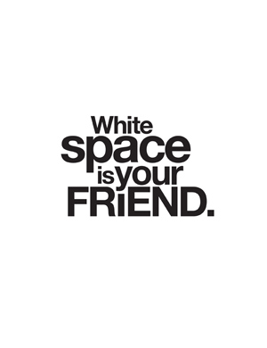
White Space – This refers to the blank space between visuals and text. It allows a break for the reader as well as directing them towards information. White space is a key element to balance, mentioned above, as it visually counters information of a text. It can provide a frame, proportionality, and breaks for topic changes. Reep actually states that this is the most important element, as without it, a document would just be a slab of text, making it hard to find relevant information and uninviting to read.
Colour – Colour can be utilised to highlight and draw attention to certain information, whilst also creating balance and coding text. Attention must be paid to the colours being used, as certain colours and colour tones represent certain things. Reep gives the examples of pale shades creating conservative, stable mood, whilst bright colours are used to portray energy. Furthermore, keep audiences in mind when using colour; usually bright colours are good for younger audiences and softer tones good for older audiences. Always have colour clashes in mind; red does not look good on blue.
Source: Reep, DC 2006 Technical writing, 6th edn,Pearson/Longman, New York.
No comments:
Post a Comment